Learn more about GitHub Copilot >
The GitHub Blog
Stay inspired with updates, ideas, and insights from GitHub to aid developers in software design and development.
June 10, 2025 16:00:00
In my spare time I enjoy building Gundam models, which are model kits to build iconic mechas from the Gundam universe. You might be wondering what this has to do with software engineering. Product engineers can be seen as the engineers who take these kits and build the Gundam itself. They are able to utilize all pieces and build a working product that is fun to collect or even play with!
Platform engineers, on the other hand, supply the tools needed to build these kits (like clippers and files) and maybe even build a cool display so everyone can see the final product. They ensure that whoever is constructing it has all the necessary tools, even if they don’t physically build the Gundam themselves.

About a year ago, my team at GitHub moved to the infrastructure organization, inheriting new roles and Areas of Responsibility (AoRs). Previously, the team had tackled external customer problems, such as building the new deployment views across environments. This involved interacting with users who depend on GitHub to address challenges within their respective industries. Our new customers as a platform engineering team are internal, which makes our responsibilities different from the product-focused engineering work we were doing before.
Going back to my Gundam example, rather than constructing kits, we’re now responsible for building the components of the kits. Adapting to this change meant I had to rethink my approach to code testing and problem solving.
Whether you’re working on product engineering or on the platform side, here are a few best practices to tackle platform problems.
Understanding your domain
One of the most critical steps before tackling problems is understanding the domain. A “domain” is the business and technical subject area in which a team and platform organization operate. This requires gaining an understanding of technical terms and how these systems interact to provide fast and reliable solutions. Here’s how to get up to speed:
- Talk to your neighbors: Arrange a handover meeting with a team that has more knowledge and experience with the subject matter. This meeting provides an opportunity to ask questions about terminology and gain a deeper understanding of the problems the team will be addressing.
- Investigate old issues: If there is a backlog of issues that are either stale or still persistent, they may give you a better understanding of the system’s current limitations and potential areas for improvement.
- Read the docs: Documentation is a goldmine of knowledge that can help you understand how the system works.
Bridging concepts to platform-specific skills
While the preceding advice offers general guidance applicable to both product and platform teams, platform teams — serving as the foundational layer — necessitate a more in-depth understanding.
- Networks: Understanding network fundamentals is crucial for all engineers, even those not directly involved in network operations. This includes concepts like TCP, UDP, and L4 load balancing, as well as debugging tools such as dig. A solid grasp of these areas is essential to comprehend how network traffic impacts your platform.
- Operating systems and hardware: Selecting appropriate virtual machines (VMs) or physical hardware is vital for both scalability and cost management. Making well-informed choices for particular applications requires a strong grasp of both. This is closely linked to choosing the right operating system for your machines, which is important to avoid systems with vulnerabilities or those nearing end of life.
- Infrastructure as Code (IaC): Automation tools like Terraform, Ansible, and Consul are becoming increasingly essential. Proficiency in these tools is becoming a necessity as they significantly decrease human error during infrastructure provisioning and modifications.
- Distributed systems: Dealing with platform issues, particularly in distributed systems, necessitates a deep understanding that failures are inevitable. Consequently, employing proactive solutions like failover and recovery mechanisms is crucial for preserving system reliability and preventing adverse user experiences. The optimal approach for this depends entirely on the specific problem and the desired system behavior.
Knowledge sharing
By sharing lessons and ideas, engineers can introduce new perspectives that lead to breakthroughs and innovations. Taking the time to understand why a project or solution did or didn’t work and sharing those findings provides new perspectives that we can use going forward.
Here are three reasons why knowledge sharing is so important:
- Teamwork makes the dream work: Collaboration often results in quicker problem resolution and fosters new solution innovation, as engineers have the opportunity to learn from each other and expand upon existing ideas.
- Prevent lost knowledge: If we don’t share our lessons learned, we prevent the information from being disseminated across the team or organization. This becomes a problem if an engineer leaves the company or is simply unavailable.
- Improve our customer success: As engineers, our solutions should effectively serve our customers. By sharing our knowledge and lessons learned, we can help the team build reliable, scalable, and secure platforms, which will enable us to create better products that meet customer needs and expectations!
But big differences start to appear between product engineering and infrastructure engineering when it comes to the impact radius and the testing process.
Impact radius
With platforms being the fundamental building blocks of a system, any change (small or large) can affect a wide range of products. Our team is responsible for DNS, a foundational service that impacts numerous products. Even a minor alteration to this service can have extensive repercussions, potentially disrupting access to content across our site and affecting products ranging from GitHub Pages to GitHub Copilot.
- Understand the radius: Or understand the downstream dependencies. Direct communication with teams that depend on our service provides valuable insights into how proposed changes may affect other services.
- Postmortems: By looking at past incidents related to our platform and asking “What is the impact of this incident?”, we can form more context around what change or failure was introduced, how our platform played a role in it, and how it was fixed.
- Monitoring and telemetry: Condense important monitoring and logging into a small and quickly digestible medium to give you the general health of the system. This could be a Single Availability Metric (SAM), for example. The ability to quickly glance at a single dashboard allows engineers to rapidly pinpoint the source of an issue and streamlines the debugging and incident mitigation process, as compared to searching through and interpreting detailed monitors or log messages.
Testing changes
Testing changes in a distributed environment can be challenging, especially for services like DNS. A crucial step in solving this issue is utilizing a test site as a “real” machine where you can implement and assess all your changes.
- Infrastructure as Code (IaC): When using tools like Terraform or Ansible, it’s crucial to test fundamental operations like provisioning and deprovisioning machines. There are circumstances where a machine will need to be re-provisioned. In these cases, we want to ensure the machine is not accidentally deleted and that we retain the ability to create a new one if needed.
- End-to-End (E2E): Begin directing some network traffic to these servers. Then the team can observe host behavior by directly interacting with it, or we can evaluate functionality by diverting a small portion of traffic.
- Self-healing: We want to test the platform’s ability to recover from unexpected loads and identify bottlenecks before they impact our users. Early identification of bottlenecks or bugs is crucial for maintaining the health of our platform.
Ideally changes will be implemented on a host-by-host basis once testing is complete. This approach allows for individual machine rollback and prevents changes from being applied to unaffected hosts.
What to remember
Platform engineering can be difficult. The systems GitHub operates with are complex and there are a lot of services and moving parts. However, there’s nothing like seeing everything come together. All the hard work our engineering teams do behind the scenes really pays off when the platform is running smoothly and teams are able to ship faster and more reliably — which allows GitHub to be the home to all developers.
Want to dive deeper? Check out our infrastructure related blog posts.
The post How GitHub engineers tackle platform problems appeared first on The GitHub Blog.
June 9, 2025 13:00:00
Welcome to the next episode in our GitHub for Beginners series, where we’re diving into the world of GitHub Copilot. This is our eighth and final episode, and it’s been quite a journey. We’ve covered a lot of different topics showcasing the power of GitHub Copilot, and you can check out all our previous episodes on our blog or as videos.
Today we’re covering that important step of code review—getting a second pair of eyes on your code. This can help catch bugs, improve code quality, and ensure consistency. We’ll also talk about refactoring code—restructuring existing code without changing its functionality. This can make things more efficient or more readable for those who need to understand it later (even if that’s yourself).
In any development project, maintaining a clean and efficient codebase is crucial to make future work easier. But in reality, things can quickly become messy as you’re focused on making it work. That’s where Copilot can come in handy. It doesn’t just assist you in writing code, it also makes the review and refactoring process smoother and more efficient.
Refactoring code
Suppose that you have a function that is long and difficult to understand. Refactoring code can make it easier to understand and ensure pieces of it aren’t too unwieldy to follow.
To use GitHub Copilot to help you with this refactoring task, open up Copilot Chat and do the following:
- Highlight the function you want to refactor in your code editor.
- In Copilot Chat, send the prompt
please provide refactoring suggestions. - Review the changes that Copilot suggests. It might break the code up into smaller pieces or optimize the logic for better performance. It might even update variable names to be aligned with your naming conventions.
- Once you’re comfortable with the suggested changes, click the Apply in editor button to apply the changes and have Copilot automatically update the file.
This works well for small changes, but there’s no reason to stop there. This is just if you want to focus Copilot’s attention on a specific area of your code. You can also have it look across entire files or your project. For example, take a look at this dashboard component. Let’s say you want to improve it.
To do so, open up the component in your editor and send Copilot Chat the following prompt:
How can I improve this code?Copilot will then give several suggestions on ways the code can be improved. You can review these suggestions and even ask Copilot to explain each step in greater detail. When you’re finished, click the Apply in editor button to have Copilot make the necessary changes.
To see this in action, check out the video version of this episode. Just remember that since Copilot is a generative AI tool, the suggestions you see might not match those in the video exactly.
You can take this a step further by asking specific and direct questions. For example, you might want to make the data fetching logic reusable across components by creating a custom hook and centralizing the logic. To do this, create a new chat conversation and ask it the following:
How can I extract the data fetching logic into a custom hook?Copilot generates refactored code that allows you to extract the logic out of the Dashboard component into a new hook directory that you can use in multiple components in the app. This makes it much more reusable! To follow through on this:
- Save the changes in a new file by selecting … > Insert into New File.
- Import the hook into the dashboard file.
- Remove the old code.
Now what if you wanted Copilot to take a look and make sure you didn’t have a bunch of redundant code in your file? Just ask it.
Is there any redundant code in this file?Copilot scans your code and identifies any redundancies that can be corrected. After reviewing the suggestions, go ahead and apply them to tighten up your code and make it a bit cleaner.
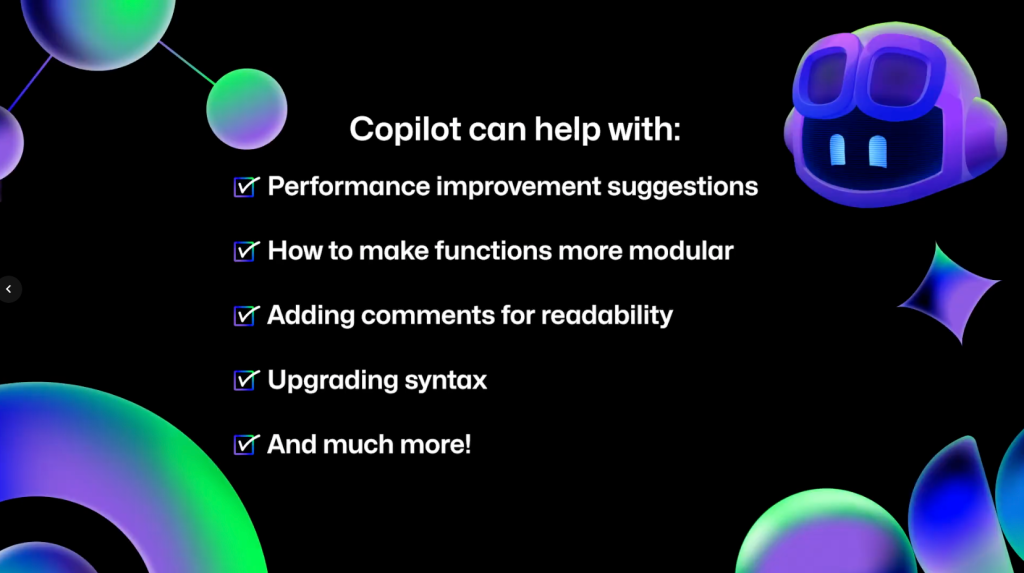
Reviewing and refactoring your code with GitHub Copilot is a great way to do an initial overview of the work you’ve done. You can also ask Copilot for performance improvement suggestions, how to make functions more modular, have it add comments, or upgrade syntax to be more modern. If you can think of a question, ask Copilot and see what it can do.
Code reviews in github.com
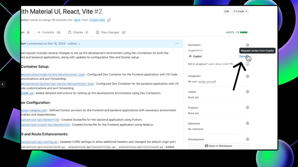
If you have the proper access, you can also get GitHub Copilot code reviews directly on github.com to make the process even more seamless. First, open up a pull request. Under the “Reviewers” section in the top-right corner, you’ll notice Copilot listed as a possible reviewer. Click Request to have Copilot review your code.
Once Copilot finishes the review, scroll down on the pull request to see any suggestions that it makes. It’s important to note that Copilot always leaves a Comment review, and never an Approve or Request changes review. This means that Copilot’s reviews will never be required nor block merges.
To accept any of Copilot’s suggestions, click Commit suggestion at the bottom of the specific suggestion you’d like to integrate. This pulls up a context menu. Click Commit changes and GitHub will update your pull request with that change.
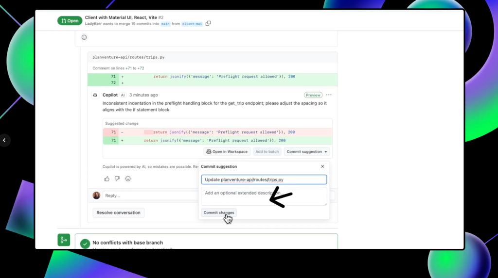
You can also batch several suggested changes by clicking the Add to batch button under individual suggestions so they are pulled into one change.
After you’ve integrated any suggestions and made any changes, you can request another review from Copilot by clicking the circular arrows in the “Reviewers” box next to Copilot’s name.
With Copilot code review, you can have Copilot perform a preliminary review of your code before asking your team for that final code review.
Key components and limitations
The key components of using Copilot for code review and refactoring can be broken down into five areas:
- Automated suggestions: Copilot suggests improvements and optimizations as you review your code.
- Consistency checks: Copilot helps maintain coding standards by suggesting consistent naming conventions and structures for your functions.
- Refactoring assistance: Copilot provides actionable refactoring suggestions, whether it’s simplifying complex functions or reorganizing your codebase.
- Error detection: Copilot can spot potential bugs or inefficiencies that you might have missed while building.
- Comment support: Copilot helps generate clear comments in your code, making it easier to understand for others.
While GitHub Copilot can do a lot, it’s important to keep in mind that you are the pilot, and we call it Copilot for a reason. It’s a powerful tool, but it does have some limitations. First and foremost, it relies on the context you provide, so unclear or poorly documented code might lead to less effective suggestions.
In addition, while Copilot can catch many issues, it’s not a substitute for a thorough human review. Always double check the suggestions it provides to ensure they align with your project’s goals and standards, as well as your organizational policies.
Your next steps
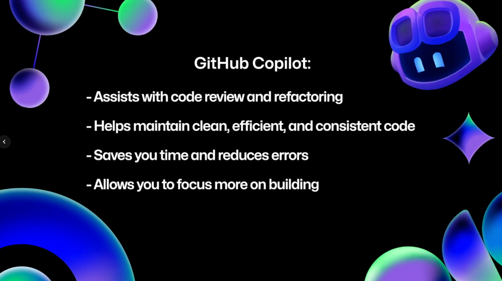
GitHub Copilot is an invaluable assistant for code review and refactoring. It helps you maintain clean, efficient, and consistent code, saving you time and reducing errors. By integrating Copilot into your workflow, you can focus more on building great features and less on the nitty-gritty aspects of code maintenance.
If you’d like to dive a little deeper into using Copilot to help with code reviews and refactoring, here are some links to get you started:
- Improving code readability and maintainability
- Refactoring code with GitHub Copilot
- Refactoring for performance optimization
- Using GitHub Copilot code review
- Configuring coding guidelines for GitHub Copilot code review
Don’t forget that you can use GitHub Copilot for free! If you have any questions, pop them in the GitHub Community thread, and we’ll be sure to respond. Thanks so much for joining us for this season of GitHub for Beginners! Don’t forget to check out our previous episodes if you haven’t already.
Happy coding!
Need some help getting through a preliminary code review? Give GitHub Copilot a try!
The post GitHub for Beginners: Code review and refactoring with GitHub Copilot appeared first on The GitHub Blog.